Post by dierk on Feb 26, 2013 14:09:11 GMT -5
I found this article on the German site www.panzer-modell.de and the author Tobias Fuß was kind enough to permit me to translate it. We both hope that you will find it entertaining and informative.
As much as I appreciate forums for the opportunities they provide for the exchange of ideas and opinions among like-minded people – I do also get fed up by some of the stuff I get to read there. Especially the recurring discussions on the subject of the ‘right’ colour should be. Not so much the questions themselves, but rather the quality of the answers are what gets my goat.
I keep seeing questions relating to this core subject, which seem to bother especially those building WWII models, and in particular the beginners amongst them.
So, what is the correct shade of Dunkelgelb/Olive Drab/Russian Green/etc? What brand of colour should you use: Tamiya, Vallejo, Humbrol, Revell, Gunze, or maybe Life Colour – or a different brand altogether? Acrylic? Enamel?
Although the question is perfectly justified, all the answers I have seen are – without exception – let’s say...questionable! Many people have dedicated themselves to this subject, without, however, coming up with a convincing answer. In my experience there is simply no such thing as the definitive Dunkelgelb, or OD, or 4BO – and I will try to explain why.
At this point I should mention that I’m a vehicle technology engineer. As of 2012 I’ve been working in this field for 8 years, spread evenly between two well-established makers of commercial vehicles. I have also spent the last six years in development and construction of military projects. Therefore, I believe I’m fairly well qualified to talk about this subject. In addition I’ve taken information from texts, applied some common sense and can draw on 25 years of modelling experience.
I’m especially surprised by how dogged and self-righteous some of the contributors to these ‘colour-debates’ are – at best these people only serve to undermine the confidence of beginners, as they totally neglect the effects modern painting techniques, like filters, washes, etc have on the shades of colours.
Lets have a look at Dunkelgelb: originally formulated during the pre-war years, but never actually introduced. Instead a totally different mustard-coloured Dunkelgelb was used – and it didn’t even have a RAL number! It was actually called ‘Dunkelgelb nach Muster’ i.e. factories were given a sample (Muster) and were told to match it as closely as possible. Basically manufacturers were told to mix their own. How close the end-result got to the ‘Muster’ depended on the talent of the painter. Even today the RAL Institute cannot say precisely which colours were mixed together and what ratios were used. Dunkelgelb was finally given a RAL number – as late as 1944...but the colour was also totally reformulated at this point, so had little in common with the Dunkelgelb used up until then. Later still, in 1945, when it became increasingly more difficult to source raw-materials, Dunkelgelb was reformulated yet again – funnily enough to a shade that was very similar to the pre-war Dunkelgelb. So, during the war the colour was officially changed two or three times, in addition there must have been additional variations due to the mixing processes used to get close to Dunkelgelb nach Muster. On top of which I bet that quality standards were not as rigorous as they are today.
It’s a similar story for OD, which was basically just a mix of khaki and black, but there were no strict rules, only guidelines for the mixing of the colours. The Federal Standard with an FS number for OD was introduced as late as 1956, and only because it was recognised during WWII that standardising colours can really be quite useful. The greatest variations in shade can be found in the Russian 4BO – as late as the cold war all sorts of liquids were sloshed together to make up the paint, just depended on what happened to be to hand.
Especially in the case of Dunkelgelb we should also bear in mind that there was a bit of a war going on at the time, so just to fulfil production targets it can be taken as read that there was all sorts of mixing, diluting and probably also cheating going on. On top of that paint-jobs were not only applied in factories, but also during repairs and refurbishment behind the front and quite often at the front itself. The colour pastes delivered to the troops came with instructions on how to dilute them, but in reality were thinned with whatever happened to be around: petrol, turpentine and god knows what else. Other factors we should consider are variations in the quality of raw materials and different techniques used by individual manufacturers, as well as the age of the paint-job, exposure to UV radiation and climactic conditions – all will have had an effect on the vehicle’s paint-job – so even the same vehicle will have looked different depending on what stage of its operational life it was in. Or take two vehicles produced one after the other on the same production line, painted by the same crew, but one was sent to Italy and the other to Russia – it really wouldn’t have taken long for them to start looking distinctly different from each other, purely down to the different terrain and climactic conditions they were exposed to.
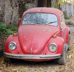
Now, if somebody comes up to me telling me he’s got a paint-chip from an original vehicle or piece of equipment, the most he can hope for is a wry smile from me. It makes no difference if it was a barn-find, dug up from a field, or whatever – the colour will still have changed markedly from what it used to look like. Ever seen an old red car? What used to be a glossy, fiery red will end up looking like a dead blood-orange after only 10 years. What would it look like after 70?
Some will now say ‘yeah, but that’s different – it’s gloss lacquer, but we’re dealing with matt camouflage colours here – they aren’t as susceptible to changes. Wrong! Exactly the opposite is true: gloss lacquers are much more resilient to the detrimental effects of environmental influences than matt ones. That’s why modern military vehicles are always painted in colours that have had about 30% gloss added to the mix. To the human eye they still look matt, but they aren’t really. If truly matt lacquers were to be used even touching it with freshly washed hands would leave permanent marks on it. Funnily enough I’ve never come across a discussion on the ratio of gloss used in Dunkelgelb on any forum – might it be due to lack of inside knowledge?
I’m aware that I won’t be able to convince everybody – after all they’re often just concerned with the correct colour for a brand-new vehicle. Well, from personal experience I can say this: in our company we only use paint for military vehicles from one supplier, as even nowadays there are slight variations in shade between manufacturers – even in the case of RAL and FS colours. But even when sourced from one and the same supplier you can find variations, if, for example, one batch was produced in March and one a few months later. It has even been known to happen in the same batch! To demonstrate this I’ll use a brand new vehicle for one of our customers as a reference: painted in RAL 6014 F9 Gelboliv. We often have these types of vehicles modified by conversion specialists. They will give any modifications a coat of paint, but even when they use RAL 6014 for these changes, the results can look markedly different - it could just be down to a slightly different ratio of gloss used. For this reason we generally add a misting of our lacquer to the vehicle before final delivery. For this the vehicle is run through a specialised piece of kit that will carry out a spectral analysis of the colour, and automatically mix a colour that will even out any differences once applied. So what does that say about colours used in WWII, when even a standardised colour like RAL 6014, produced to modern quality standards, mixed by one and the same company can still have variations in shade?
I also really don’t get this fixation on the RAL system. There’s always someone who claims to have found an original RAL colour-chart from 1944, or whatever – at best it belongs in a museum. Have you ever put a white sheet of paper into the sun and watched it go yellow under the influence of UV radiation? The age alone will have made the chart utterly meaningless. FS (and probably also RAL) colour charts have to be replaced every two years in today’s commercial vehicle industry, as they are considered to be no longer true to the colour after that time. But colour charts aren’t actually used as a reference by companies mixing colours. For quality control purposes an actual painted piece of sheet metal is used. This is stored in a lightless room in the quality control lab – guess what? Even that has to be replaced on a regular basis.
The stuff you find on the web, purporting to be RAL lists for Dunkelgelb and other Wehrmacht colours, like DAK Sandgelb are just post-war constructs – at best you could call them educated guesses - that should be used as a guideline only. In my opinion it is simply impossible to tell what the exact shade of any WWII colour was, without knowing exactly which colours in what ratios were used to mix it – making the whole discussion somewhat pointless. It’s all pure speculation, at best we might have a rough idea of the shades used – but let’s not forget, they weren’t truly standardised anyway.
Now, let’s deal with the old favourite “I’ve got an original colour photograph”. The biggest misconception of them all! It’s not just because the film itself was of varying quality, probably until well into the 80s, every medium you choose to display the pictures will have some influence on what it looks like. The same picture displayed on three different PC monitors will look different on each one. It gets even worse once you print the picture using an uncalibrated printer – purely down to the colours in the cartridges, density and quality of the pigments as well as brightness. And I haven’t even mentioned differences brought about by daylight – but I will now:

Above are three pictures of the same model. All were taken on the same day using the same camera, but at different times and light-levels: overcast, sunny and shady. Can somebody tell me which colour I used for the paintjob? Didn’t think so. By the way, the picture on the left comes closest to the original look.
And finally: even if we did have a bottle of colour exactly true to the original, it still wouldn’t really get us closer to the Holy Grail, as we still have to consider the scale effect – this is the phenomenon that makes objects appear to look lighter with increasing distance between the viewer and the object, caused by the molecules that make up the atmosphere. Strictly speaking we should therefore be adding increasing amounts of white to the base colour the smaller the scale that we’re building is. But then you also end up introducing yet another variable that will affect the trueness of your colour. Also, you would have to mix your colours differently, depending on whether you’re building a model for a sunny day in Russia, or an overcast one in Normandy! Finally you also have to consider that washes, filters, aging and weathering will all affect what the colour looks like – all these processes will inevitably falsify a supposedly ‘correct’ colour.
What I really want to say is this: dear modellers, don’t spend ages debating which colours you should use so your model ends up looking ‘right’ – even if your chosen subject is a factory-fresh vehicle, but especially if you’re building one that has seen an extended period of use. Don’t get me wrong: I’m all for asking questions and accepting help, just don’t get blinkered and blindly follow what others think is the only true path to originality. The best advice I can give is to study other people’s builds and then to try and find your own way of doing things. Try colours from different makers and then settle on the one you find easiest to work with and that give you results you are happy with.
The only really important thing is that you’re happy with your model, that it ‘feels right’ to you – because if it looks right, it is. After all, building models also involves aspects of art, interpretation of your subject matter an imagination. So, have fun instead of spending ages on the (ultimately fruitless) hunt for THE correct Dunkelgelb.
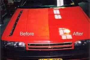
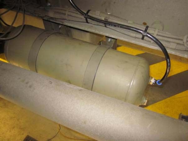
Although I’ve typed my fingers to the bone and have hopefully argued my case well, there will probably still be a couple of Doubting Thomas’s who will simply not face up to reality. Well, as we all know, a picture speaks a thousand words. So I’ll leave you with a detail shot of a real vehicle just before final delivery. All parts are in original condition as fitted by the factory...and all parts are painted RAL 6014. Need I say more?
As much as I appreciate forums for the opportunities they provide for the exchange of ideas and opinions among like-minded people – I do also get fed up by some of the stuff I get to read there. Especially the recurring discussions on the subject of the ‘right’ colour should be. Not so much the questions themselves, but rather the quality of the answers are what gets my goat.
I keep seeing questions relating to this core subject, which seem to bother especially those building WWII models, and in particular the beginners amongst them.
So, what is the correct shade of Dunkelgelb/Olive Drab/Russian Green/etc? What brand of colour should you use: Tamiya, Vallejo, Humbrol, Revell, Gunze, or maybe Life Colour – or a different brand altogether? Acrylic? Enamel?
Although the question is perfectly justified, all the answers I have seen are – without exception – let’s say...questionable! Many people have dedicated themselves to this subject, without, however, coming up with a convincing answer. In my experience there is simply no such thing as the definitive Dunkelgelb, or OD, or 4BO – and I will try to explain why.
At this point I should mention that I’m a vehicle technology engineer. As of 2012 I’ve been working in this field for 8 years, spread evenly between two well-established makers of commercial vehicles. I have also spent the last six years in development and construction of military projects. Therefore, I believe I’m fairly well qualified to talk about this subject. In addition I’ve taken information from texts, applied some common sense and can draw on 25 years of modelling experience.
I’m especially surprised by how dogged and self-righteous some of the contributors to these ‘colour-debates’ are – at best these people only serve to undermine the confidence of beginners, as they totally neglect the effects modern painting techniques, like filters, washes, etc have on the shades of colours.
Lets have a look at Dunkelgelb: originally formulated during the pre-war years, but never actually introduced. Instead a totally different mustard-coloured Dunkelgelb was used – and it didn’t even have a RAL number! It was actually called ‘Dunkelgelb nach Muster’ i.e. factories were given a sample (Muster) and were told to match it as closely as possible. Basically manufacturers were told to mix their own. How close the end-result got to the ‘Muster’ depended on the talent of the painter. Even today the RAL Institute cannot say precisely which colours were mixed together and what ratios were used. Dunkelgelb was finally given a RAL number – as late as 1944...but the colour was also totally reformulated at this point, so had little in common with the Dunkelgelb used up until then. Later still, in 1945, when it became increasingly more difficult to source raw-materials, Dunkelgelb was reformulated yet again – funnily enough to a shade that was very similar to the pre-war Dunkelgelb. So, during the war the colour was officially changed two or three times, in addition there must have been additional variations due to the mixing processes used to get close to Dunkelgelb nach Muster. On top of which I bet that quality standards were not as rigorous as they are today.
It’s a similar story for OD, which was basically just a mix of khaki and black, but there were no strict rules, only guidelines for the mixing of the colours. The Federal Standard with an FS number for OD was introduced as late as 1956, and only because it was recognised during WWII that standardising colours can really be quite useful. The greatest variations in shade can be found in the Russian 4BO – as late as the cold war all sorts of liquids were sloshed together to make up the paint, just depended on what happened to be to hand.
Especially in the case of Dunkelgelb we should also bear in mind that there was a bit of a war going on at the time, so just to fulfil production targets it can be taken as read that there was all sorts of mixing, diluting and probably also cheating going on. On top of that paint-jobs were not only applied in factories, but also during repairs and refurbishment behind the front and quite often at the front itself. The colour pastes delivered to the troops came with instructions on how to dilute them, but in reality were thinned with whatever happened to be around: petrol, turpentine and god knows what else. Other factors we should consider are variations in the quality of raw materials and different techniques used by individual manufacturers, as well as the age of the paint-job, exposure to UV radiation and climactic conditions – all will have had an effect on the vehicle’s paint-job – so even the same vehicle will have looked different depending on what stage of its operational life it was in. Or take two vehicles produced one after the other on the same production line, painted by the same crew, but one was sent to Italy and the other to Russia – it really wouldn’t have taken long for them to start looking distinctly different from each other, purely down to the different terrain and climactic conditions they were exposed to.
Now, if somebody comes up to me telling me he’s got a paint-chip from an original vehicle or piece of equipment, the most he can hope for is a wry smile from me. It makes no difference if it was a barn-find, dug up from a field, or whatever – the colour will still have changed markedly from what it used to look like. Ever seen an old red car? What used to be a glossy, fiery red will end up looking like a dead blood-orange after only 10 years. What would it look like after 70?


Some will now say ‘yeah, but that’s different – it’s gloss lacquer, but we’re dealing with matt camouflage colours here – they aren’t as susceptible to changes. Wrong! Exactly the opposite is true: gloss lacquers are much more resilient to the detrimental effects of environmental influences than matt ones. That’s why modern military vehicles are always painted in colours that have had about 30% gloss added to the mix. To the human eye they still look matt, but they aren’t really. If truly matt lacquers were to be used even touching it with freshly washed hands would leave permanent marks on it. Funnily enough I’ve never come across a discussion on the ratio of gloss used in Dunkelgelb on any forum – might it be due to lack of inside knowledge?
I’m aware that I won’t be able to convince everybody – after all they’re often just concerned with the correct colour for a brand-new vehicle. Well, from personal experience I can say this: in our company we only use paint for military vehicles from one supplier, as even nowadays there are slight variations in shade between manufacturers – even in the case of RAL and FS colours. But even when sourced from one and the same supplier you can find variations, if, for example, one batch was produced in March and one a few months later. It has even been known to happen in the same batch! To demonstrate this I’ll use a brand new vehicle for one of our customers as a reference: painted in RAL 6014 F9 Gelboliv. We often have these types of vehicles modified by conversion specialists. They will give any modifications a coat of paint, but even when they use RAL 6014 for these changes, the results can look markedly different - it could just be down to a slightly different ratio of gloss used. For this reason we generally add a misting of our lacquer to the vehicle before final delivery. For this the vehicle is run through a specialised piece of kit that will carry out a spectral analysis of the colour, and automatically mix a colour that will even out any differences once applied. So what does that say about colours used in WWII, when even a standardised colour like RAL 6014, produced to modern quality standards, mixed by one and the same company can still have variations in shade?
I also really don’t get this fixation on the RAL system. There’s always someone who claims to have found an original RAL colour-chart from 1944, or whatever – at best it belongs in a museum. Have you ever put a white sheet of paper into the sun and watched it go yellow under the influence of UV radiation? The age alone will have made the chart utterly meaningless. FS (and probably also RAL) colour charts have to be replaced every two years in today’s commercial vehicle industry, as they are considered to be no longer true to the colour after that time. But colour charts aren’t actually used as a reference by companies mixing colours. For quality control purposes an actual painted piece of sheet metal is used. This is stored in a lightless room in the quality control lab – guess what? Even that has to be replaced on a regular basis.
The stuff you find on the web, purporting to be RAL lists for Dunkelgelb and other Wehrmacht colours, like DAK Sandgelb are just post-war constructs – at best you could call them educated guesses - that should be used as a guideline only. In my opinion it is simply impossible to tell what the exact shade of any WWII colour was, without knowing exactly which colours in what ratios were used to mix it – making the whole discussion somewhat pointless. It’s all pure speculation, at best we might have a rough idea of the shades used – but let’s not forget, they weren’t truly standardised anyway.
Now, let’s deal with the old favourite “I’ve got an original colour photograph”. The biggest misconception of them all! It’s not just because the film itself was of varying quality, probably until well into the 80s, every medium you choose to display the pictures will have some influence on what it looks like. The same picture displayed on three different PC monitors will look different on each one. It gets even worse once you print the picture using an uncalibrated printer – purely down to the colours in the cartridges, density and quality of the pigments as well as brightness. And I haven’t even mentioned differences brought about by daylight – but I will now:

Above are three pictures of the same model. All were taken on the same day using the same camera, but at different times and light-levels: overcast, sunny and shady. Can somebody tell me which colour I used for the paintjob? Didn’t think so. By the way, the picture on the left comes closest to the original look.
And finally: even if we did have a bottle of colour exactly true to the original, it still wouldn’t really get us closer to the Holy Grail, as we still have to consider the scale effect – this is the phenomenon that makes objects appear to look lighter with increasing distance between the viewer and the object, caused by the molecules that make up the atmosphere. Strictly speaking we should therefore be adding increasing amounts of white to the base colour the smaller the scale that we’re building is. But then you also end up introducing yet another variable that will affect the trueness of your colour. Also, you would have to mix your colours differently, depending on whether you’re building a model for a sunny day in Russia, or an overcast one in Normandy! Finally you also have to consider that washes, filters, aging and weathering will all affect what the colour looks like – all these processes will inevitably falsify a supposedly ‘correct’ colour.
What I really want to say is this: dear modellers, don’t spend ages debating which colours you should use so your model ends up looking ‘right’ – even if your chosen subject is a factory-fresh vehicle, but especially if you’re building one that has seen an extended period of use. Don’t get me wrong: I’m all for asking questions and accepting help, just don’t get blinkered and blindly follow what others think is the only true path to originality. The best advice I can give is to study other people’s builds and then to try and find your own way of doing things. Try colours from different makers and then settle on the one you find easiest to work with and that give you results you are happy with.
The only really important thing is that you’re happy with your model, that it ‘feels right’ to you – because if it looks right, it is. After all, building models also involves aspects of art, interpretation of your subject matter an imagination. So, have fun instead of spending ages on the (ultimately fruitless) hunt for THE correct Dunkelgelb.
Although I’ve typed my fingers to the bone and have hopefully argued my case well, there will probably still be a couple of Doubting Thomas’s who will simply not face up to reality. Well, as we all know, a picture speaks a thousand words. So I’ll leave you with a detail shot of a real vehicle just before final delivery. All parts are in original condition as fitted by the factory...and all parts are painted RAL 6014. Need I say more?




 . My gut-instinct told me most of what came up in the article, but when you're new to the hobby or a forum and somebody's banging on about 'real' colours, you assume they've been doing it for a while and know what they're talking about, and you start doubting your own instincts.
